The Plotting module is used to display and print PipeLay plots. It is user-friendly, so that high quality plots can be prepared quickly and easily, and is highly flexible to give you extensive control over the presentation of results. It allows you, for example, to edit captions, superpose plots, prepare variable/variable plots, and arrange several plots on a single page. Plots from the Plotting module can be printed or they can be copied and pasted into presentations and reports made with other Windows applications.
There are a number of ways of launching the Plotting module. Firstly, you can launch it by choosing PipeLay Plotting Module on the PipeLay Start Menu. Alternatively, it is automatically launched when you click on the Open Plot Files button on the Results tab on the Analysis component. Finally, it is likewise automatically launched if you double-click on any individual plot file or list of plot files produced by PipeLay, for example after having clicked on Open Results Directory on the Results tab.
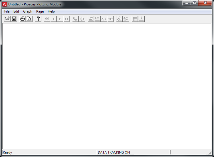
The Plotting module main window is shown below.

Plotting Module
As you can see, there is a menu bar and a toolbar at the top of the window; these will be described in the ‘Menus & Toolbar’ article. There is also a status bar at the bottom of the window. When you position the cursor over a menu command or a toolbar button, a brief description of its function is displayed on the left side of the status bar. In addition, if the cursor is positioned within a graph area (and provided so-called data tracking is enabled), the cursor location in graph coordinates is displayed on the right side of the status bar. The ‘Page Settings’ article provides further details of this data tracking facility.
If you’ve launched the Plotting module by the first of the three methods listed above, no plots are displayed in the window initially, as files for plotting have not been selected yet. At this stage too, most of the menu and toolbar commands are not enabled. So, the first step in using the Plotting module in this case is to select one or more plot files. You can then adjust their layout and appearance. These procedures are described in the following article, ‘Selecting Plot Files’. Of course if you launch the module using either of the other methods, there is no requirement to select files – they are already selected.
Before proceeding to a detailed discussion of the Plotting module capabilities, the terms Plot Files, Pages, Graphs and Data Sets are first explained in the context of the Plotting module; and one particular type of plot, the structure snapshot, is briefly discussed.
A data set is a single set of data, which is drawn in a single colour. A graph consists of one or more data sets on a single set of axes, with a legend section. The legend contains one entry - a title, line colour and symbol - for each data set. A page consists of one or more graphs and a title block (which can be hidden from view). If you wish to place more than one graph on a page, you simply specify how many rows and columns to use. The Plotting module always fits the contents of a single page in the main window. If you resize the Plotting window, all graphs on the page are automatically resized to fit. Likewise, when you print a page, its contents are automatically resized to fit the printed page’s size and orientation.
The purpose of the Plotting module is to display plots; they are actually generated by the automated and customised postprocessing facilities in PipeLay. Typically, a plot file produced by PipeLay contains a single graph with a single data set. However, you can superpose plot files in the Plotting module to produce a graph with multiple data sets, and you can arrange multiple graphs on a single page. In addition, you can edit titles and legends and adjust ranges in the Plotting module. When you save a plot file in the Plotting module, all of the graphs on the page are saved in a single file.
When the mouse hovers briefly over any data point you receive additional information on it. For the case of a spectrum, snapshot or statistical plot, you are shown the element and local node number for each data point. On a statistical plot you are also shown the time of peak occurrence. The figure below illustrates this facility in operation.

Tool Tips
A structure snapshot is a plot of the configuration of all or part of a structure at a particular point in time. For plots of this type, the Plotting module by default uses a 1:1 aspect ratio between the X and Y axes, so that the structure proportions are accurately represented. To do this, the Plotting module constrains graphs of structure snapshots to be square-shaped, and ensures that the difference between the maximum and minimum values on both axes is always the same. If you try to zoom in on a region of a structure snapshot that is not square, the Plotting module will automatically extend the narrower dimension to match the wider dimension.
If you wish, you can turn off the 1:1 aspect ratio facility. You can do so using the Graph - 1:1 Aspect Ratio option on the menu bar. This will be discussed further in the section ‘Menus and Toolbar’.